Decoding the Dopamine Dressing Movement: Bright Colors for Mood Boosting
Most people believe that dressing "well" requires a neutral palette of beige, navy, or charcoal to project professionalism and sophistication. This misconception stems from a long-standing adherence to the idea that color is a distraction rather than a tool. In reality, color is a physiological trigger. The concept of "dopamine dressing" isn't just a social media trend; it is the intentional use of color to stimulate the brain'ality and elevate mood through visual stimuli.
Dopamine is a neurotransmitter associated with pleasure, motivation, and reward. While you cannot "wear" a chemical, the visual input of high-saturation hues can trigger a psychological response that alters your perception of your environment and yourself. When you choose a vibrant cobalt blue or a saturated tangerine, you are not just picking a garment; you are engaging in a form of sensory therapy.
The Science of Color and Psychology
To use color effectively, you must understand how different wavelengths affect the human psyche. Color psychology is not an exact science, but certain patterns are consistent across various cultures and neurological studies. When building a dopamine-rich wardrobe, it helps to categorize colors by the emotional frequency they carry.
- Red: Associated with adrenaline and physical energy. A bright crimson silk blouse can increase heart rate and feelings of confidence.
- Yellow: Linked to serotonin production. Soft butter yellows are calming, while vivid sunflower yellows are highly stimulating and associated with optimism.
- Blue: Often perceived as calming, but high-saturation electric blues can stimulate mental clarity and focus.
- Green: The color of equilibrium. Emerald tones provide a sense of stability and renewal, making them ideal for high-stress environments.
- Pink: Ranges from the soothing nature of blush to the high-energy, playful vibration of fuchsia.
The goal of dopamine dressing is not to wear every color at once, but to strategically deploy the hues that counteract your current emotional state. If you are feeling lethargic, reach for high-chroma yellows. If you are feeling anxious, look toward grounded, saturated greens or deep teals.
Strategic Implementation: Three Approaches to Color
There are multiple ways to integrate high-impact color into a daily routine without feeling like you are wearing a costume. Depending on your comfort level, you can approach this through total immersion, tactical accents, or texture play.
1. The Monochromatic Statement
The most direct way to experience the effects of dopamine dressing is through a monochromatic look. This involves wearing different shades and textures of a single color from head to toe. For example, pairing a bright violet satin slip skirt with a chunky knit violet sweater creates depth while maintaining a cohesive visual line. This method is particularly effective because it creates a "color block" effect that commands attention and reinforces the psychological impact of the chosen hue.
2. The High-Contrast Accent
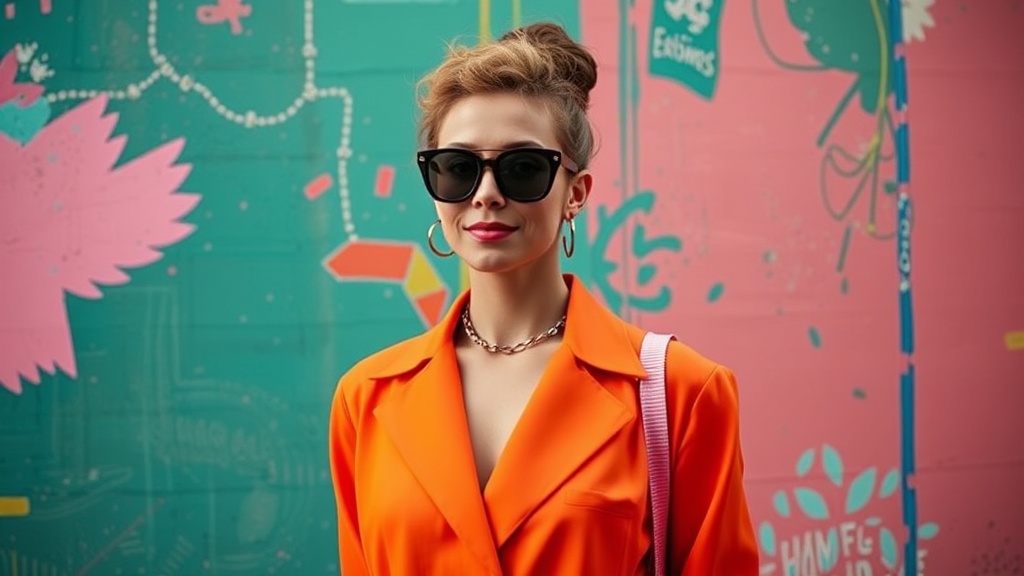
If a full-color outfit feels too intimidating, use the "pop" method. This involves a neutral base—such as a classic black jumpsuit or a crisp white linen set—paired with one high-intensity element. A pair of Gucci bright green loafers or a structured bright orange handbag can act as a focal point. This approach allows you to test how much color you can handle in a social setting before committing to a full-color ensemble.
3. The Textural Layering Method
Color behaves differently depending on the fabric. A matte cotton in bright red looks vastly different from a high-shine red silk or a textured red wool. To make dopamine dressing look sophisticated rather than chaotic, mix textures. Try a bright cobalt blue velvet blazer over a light blue silk camisole. The way light hits the velvet versus the silk adds a dimension of "visual interest" that prevents the color from looking flat or one-dimensional.
Color Coordination for Different Occasions
Dopamine dressing is often unfairly categorized as "leisurewear only." However, you can adapt these principles for any setting, from a corporate boardroom to a formal gala.
Professional Settings
In a professional environment, the key is to use "grounded" vibrance. Instead of a neon pink, opt for a deep, saturated raspberry. Instead of a bright primary yellow, try a rich ochre or mustard. A structured blazer in a deep emerald green paired with charcoal trousers maintains authority while providing the mood-boosting benefits of the color. This ensures you look professional while still utilizing the psychological benefits of color.
Casual and Social Settings
This is where you can truly let go. For a weekend brunch or a gallery opening, lean into high-saturation and playful patterns. A bright turquoise sundress or a lemon-yellow linen set is perfect for these environments. When building these looks, remember that you can also incorporate color through accessories like statement earrings or bold scarves. If you are building a long-term wardrobe, consider building a capsule wardrobe that includes high-quality, colorful pieces that can be rotated through the seasons.
The Role of Beauty and Accessories
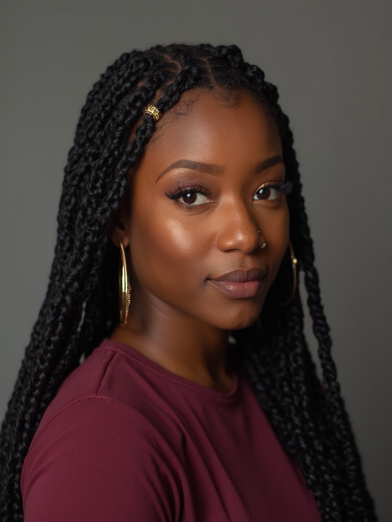
Your beauty routine is a vital component of the dopamine dressing movement. Color doesn't stop at your clothes; it extends to your skin, eyes, and lips. If you are wearing a neutral outfit, a bold lip can serve as your primary dopamine trigger.
Consider a classic red lip, but look for modern variations. Instead of a traditional matte, try a high-shine lacquer or a blurred, "just-bitten" tint. If your outfit is highly colorful, you might choose to keep your skin looking luminous and fresh—focusing on a glass skin routine to ensure your complexion looks radiant and hydrated under the bright colors. A dewy, light-reflecting base provides a clean canvas that allows vibrant clothing to pop without looking heavy or overly made-up.
Example Color Combinations for Beauty:
- The Sunset Look: An orange silk top paired with a warm, terracotta blush and a gold-flecked eyeshadow.
- The Cool Tones: A lavender sweater paired with a soft lilac eyeliner and a clear, high-shine lip gloss.
- The Power Look: A navy blue suit paired with a deep berry lip and a subtle, shimmering champagne highlighter.
Common Pitfalls to Avoid
While the goal is play and experimentation, there are a few mistakes that can make a dopamine-heavy outfit feel overwhelming rather than uplifting.
- Ignoring Fit: Bright colors draw the eye. If a garment is poorly tailored, the color will highlight the fit issues. Ensure your colorful pieces are well-fitted or intentionally oversized to maintain a sense of intentionality.
- Overwhelming the Senses: While more is often more in dopamine dressing, try to avoid clashing high-saturation colors that fight for attention. If you are wearing a bright pink top, avoid a bright green bottom unless you are intentionally aiming for a high-contrast, maximalist aesthetic.
- Ignoring Undertones: A color that looks great on a mannequin might not suit your skin tone. If a color makes you look washed out, it won't provide the dopamine boost you're looking for. Experiment with warm vs. cool tones to find which "version" of a color works best for you.
Conclusion: Making Color a Daily Ritual
Dopamine dressing is not about following a trend; it is about reclaiming your agency over your mood through the medium of fashion. It is a rejection of the "safe" and the "neutral" in favor of the expressive and the joyful. Start small. Add a bright nail polish, a colorful silk scarf, or a vibrant pair of socks to your routine. Observe how these small changes affect your energy levels and your confidence. Beauty is not a performance to be perfected; it is a tool for living more vibrantly.